Top 20 Mandela Effect Examples In Logos
- Double Stuf Oreos
- The Raisin Bran Sun's Sunglasses
- Uncle Sam's Hat
- Häagen-Dazs
- Pillsbury Doughboy's Neckerchief
- Oscar Mayer
- Peace Symbol
- Coke Zero
- Ford's Curl
- Kit Kat
- Jif or Jiffy?
- 7 Up's Hyphen
- Target's Ring Count
- Tony The Tiger's Nose
- The Quaker Oats Man's Hat & Age
- The Laughing Cow's Rings
- Fruit Loops
- The Monopoly Man's Monocle
- Starbucks Star
- Fruit of the Loom's Cornucopia
#20: Double Stuf Oreos
We’re not here to argue about whether or not Double Stuf Oreos are better than regular Oreos… They are. No, today we just want to point out the odd fact that while they claim to have double the amount of icing, the packaging has half the number of “F”s most people think it does. That’s right: the cookie may have more stuff, and yet Double Stuf Oreos are spelled with only one “F”. And as far as we can tell, “Stuf” with one “F” isn’t even a real word in the English language. Thankfully the cookies are real though.
#19: The Raisin Bran Sun's Sunglasses
Kellogg’s Raisin Bran cereal has been around since 1949, and since 1967 the packaging has had a sun on the box. This part we can all agree on. Where things get weird is the fact that, in the over 50 years since the Raisin Bran Sun was introduced, the Solar System Star has never been portrayed on the packaging wearing sunglasses. There are some fake, photoshopped images online that have the sun in shades, but the truth is that sunglasses have never been a part of its look. And we guess that makes sense. The sun is really bright, but it isn’t looking at itself. So, why would the astronomical object need to wear sunglasses?
#18: Uncle Sam's Hat
We all know the iconic WWI recruitment poster featuring Uncle Sam pointing out at the viewer, above the words “I WANT YOU FOR U.S. ARMY”. We’re sure many of you can picture it now. The man with the white hair and goatee, wearing a blue coat and a tall hat with a blue stripe across the base, white stars and vertical red and white stripes. Wrong! Although, that’s how so many of us remember the image, the truth is that in the original poster Uncle Sam’s hat doesn’t have red and white stripes. Yes, every Halloween and 4th of July you’ll see Uncle Sam costumes with a striped hat. And now you can be the one to tell them they’re doing it wrong.
#17: Häagen-Dazs
As fancy as it sounds, the truth is that the brand name Häagen-Dazs is totally made up. It was conceived of by the company’s founder, the Polish-Jewish Reuben Mattus, who wanted to pay homage to Denmark’s positive WWII reputation with respect to the Jewish people. As a made up word, there are a bunch of different ways the spelling of Häagen-Dazs could’ve gone. And in fact, many people assume it’s spelled differently than it actually is. While most of us remember the umlaut over the first “a” in Häagen, it’s the “Dazs” that is at the root of many arguments. Is it spelt with a “Z” or an “S”? Well, actually it's both!
#16: Pillsbury Doughboy’s Neckerchief
No, we’re not going to tell you that the Pillsbury Doughboy doesn’t wear a neck accessory. He does - you remembered that correctly. The question we’re here to answer is… what color is said neckerchief? And while many of us would quickly, and with great certainty, respond with the color blue, the fact is Poppin’ Fresh (yes, that’s his real name) wears a white scarf around his neck. Yup, his eyes are blue, but that neckerchief is all white. Don’t feel bad though. “The Simpsons” and “Family Guy” both got it wrong also.
#15: Oscar Mayer
You’d think that having one of the most famous commercial jingles of all time would allay any confusion as to how to spell Oscar Mayer. You might think that, but you’d be wrong. The company has been spelling out their name for us in song since the 1970s. And yet there are still a large group of folks who swear that the kids are singing “M-E-Y-E-R” instead of “M-A-Y-E-R”. Maybe those people are under the false impression that the company was started by famed mobster Meyer Lansky rather than German immigrant Oscar F. Mayer.
#14: Peace Symbol
Designed in 1958 by British artist Gerald Holtom as part of the campaign for nuclear disarmament, the “peace symbol” is a mashup of the semaphore signals for the letters "N" and "D". The “D” being the vertical line and the “N” being the two lines going down at 45 degree angles - and all of it neatly enclosed in a circle. This is, and always has been the symbol. However, that doesn’t stop people from swearing they remember it looking differently at one point - either upside down with the “limbs” reaching upwards, or with the vertical line stopping at the apex of the angled lines - the latter of which would just make the Mercedes Benz logo.
#13: Coke Zero
The Coca-cola company has rebranded their zero sugar cola and reformulated the recipe a couple times since they introduced it back in 2005. Back then it was Coca-Cola Zero. In 2017 they switched up the formula a little bit and changed the name to Coca-Cola Zero Sugar, and in 2021 there was another formulation change. However, despite the name and recipe changes over the years, there’s one thing that’s never been said or written on one of their cans… Coke Zero. That’s right: while media outlets and consumers have often referred to it as Coke Zero, the Coca-Cola company has never actually branded any of their cans or bottles as such.
#12: Ford’s Curl
Ford is one of the most well known car companies on the planet and have been making vehicles for over a century. While you’d think that such a long-lasting brand’s logo would be imprinted in everyone’s memory, many “motorheads” have had to pump the brakes when they see it today. Many are confused about the logo’s curly cue on the end of the “F.” Having been part of the logo since 1911, it’s certainly not a recent addition. The logo many remember, however, has no such curl. This is a “Ford tough” one. And speaking of car logos: Volkswagen has always had a space between the V and the W. And Volvo has never had a circle without the corner-pointing arrow.
#11: Kit Kat
Maybe it’s because we call them Kit Kat bars that we assume there to be a bar in between the two words. Or maybe it's the “give me a break” jingle and we think of a hyphen as a visual “break”. But no matter why we think Kit Kat is written with a dash between the Kit and the Kat, it isn’t. Officially Kit Kat has always been two words. And although it is sometimes stylised as one word (so no spaces in between the Kit and the Kat) in certain nations - it has never had a dash.
#10: Jif or Jiffy?
While this is more of a brand name Mandela Effect, the logo may play a role in the confusion. Jif is the peanut butter of choice for many, including moms - as the ads used to say. But, there are those who remember the name of this particular brand of peanut butter as “Jiffy,” not Jif. The logo itself does suggest 3 letters, to go with its three colored bars. It is possible people are just conflating it with rival peanut butter brand, Skippy. Or it could be tied to Jiffy Lube, the car service chain. Maybe it’s from Jiffy Pop, the popcorn brand? Either way, this Mandela Effect has made us hungry.
#9: 7 Up’s Hyphen
7 Up is a fairly popular soft drink, with its distinctive green color scheme, accented by a red dot. However, the location of this dot, and its role, has caused some serious debate. Its position has changed depending on the marketing of the time. Currently it acts as a pseudo-hyphen between the number 7 and the word “up.” Which is strange to some, because 7 Up no longer has a hyphen in the name. Outside of America, it’s all just one word – “7Up.” But in the United States, many recall a hyphen being a permanent fixture of the brand’s name and logo. Hmm, maybe Cool Spot knows something…
#8: Target’s Ring Count
Target has a very distinct brand for being an all-in-one store. Their logo is fairly memorable too, with their red and white color scheme featuring prominently in advertising campaigns. Still, for as famous as its logo is, it misses the mark for some people. Target’s, uh, “target” has a red dot with a single red ring around it. However, some people remember the logo having multiple rings. And while the logo did have multiple rings in the 1960s, folks recall the logo being different much more recently. Which begs the question - is this a false memory, or a bullseye recollection?
#7: Tony The Tiger’s Nose
Frosted Flakes have been a staple of the grocery store cereal aisle forever. Front and center on every box is the brand’s mascot, Tony the Tiger. While the big guy has gone through several redesigns, his current appearance is his most iconic – large body, red bandana, and a blue nose. However, that last feature is something some people take issue with. There are those who remember Tony the Tiger having a black nose. And he used to, in the early days. But, he eventually adopted a colorful snout. Is this a case of people confusing Tony with another cartoon tiger? If someone can get to the bottom of this that would be GRRRRRRRR-EAT!
#6: The Quaker Oats Man’s Hat & Age
Quaker Oats has been around for almost 150 years! Known for their breakfast cereals, both hot and cold, Quaker Oats has featured a consistent mascot. Based on William Penn, a real-life Quaker from the 17th century, some have begun to question this mascot’s appearance. Many breakfast enthusiasts remember the Quaker Oats man being significantly older and sporting a triangular hat. This, of course, is in contrast with the middle-aged man with a rounder hat seen today (and always). It’s possible the man’s white hair, or wig, led people to assume he must be older than he is. Triangular hats were also associated with the time period and the culture of Quakers. Let’s discuss over a bowl of cereal.
#5: The Laughing Cow’s Rings
A French cheese brand, The Laughing Cow, features a mascot that is, surprise surprise, a laughing bovine. The logo features the crimson cow with a jovial expression on every product. But, there’s some disagreement when it comes to this farm animal’s accessories. Many cheese lovers swear that the happy mascot used to have gold rings, either in her ears or through her nose - or both. The Laughing Cow does indeed have earrings, but her ear tags are instead shaped like the packages a lot of the cheese comes in. This cheesy mystery is no laughing matter!
#4: Fruit Loops
The colorful cereal does boast fruit flavors, and for years Toucan Sam told us to follow his nose, “For the fruity taste that shows!” But with that being said, the cereal itself has never actually spelled the “fruit” part of its name “f-r-u-i-t”. Instead, the “Froot” like the “Loops” have always been written with a, James Bond would be proud, double-O. So, not only is the cereal probably overdosing our children with a morning sugar rush, but it’s also teaching them improper spelling. It’s a good thing they taste so good.
#3: The Monopoly Man’s Monocle
The beloved mascot of the board game Monopoly is named Rich Uncle Pennybags, but you may refer to him as “Mr. Monopoly” or simply “the Monopoly Man.” His look embodies that of a filthy rich tycoon – top hat, mustache, monocle. Wait - that last one may be a false memory. Mr. Monopoly has apparently never had a monocle. Plenty of people and TV shows have referenced this detail in their parodies, but when it comes to official merchandise, that monocle is about as real as Monopoly money. Could people be confusing him with Mr. Peanut? Or, has someone sent part of our collective reality “directly to jail?”
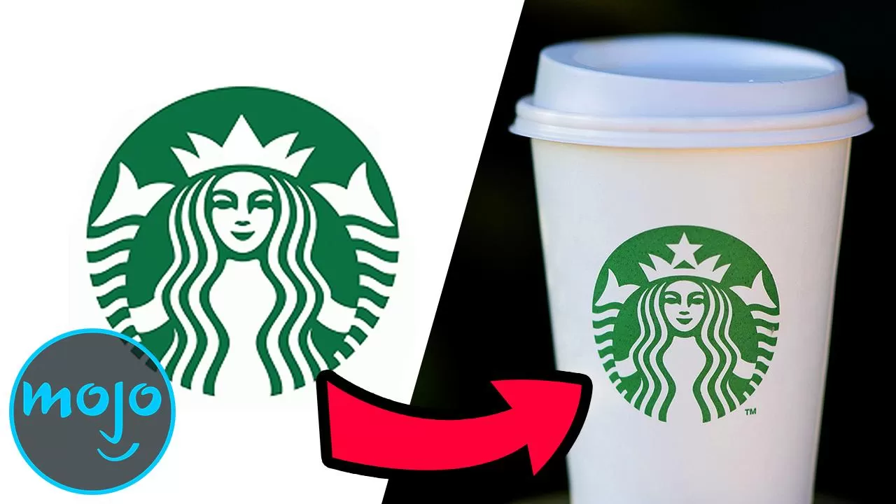
#2: Starbucks Star
Starbucks is arguably the biggest name in coffee. Yes, there’s Dunkin’ Donuts and Tim Hortons out there, but Starbucks is the global brand that everyone knows. Or, so you’d think! Despite the millions of cups likely sold since the start of this video, some Starbucks patrons are surprised about something on its famous logo – the star above the mythological siren’s head. Many customers remember the logo having only a crown with no star above it. Well, the siren did indeed lack a star at one point, but that was before its iconic green look. If anyone does decide to devote themselves to this potential mystery, they’ll definitely need a lot of caffeine. We’re just sayin.’
#1: Fruit of the Loom’s Cornucopia
This well-known Mandela Effect concerns the logo of popular clothing brand, Fruit of the Loom. The company has been around for almost 175 years! And while its logo, featuring assorted fruits, has definitely gone through some changes over the years, there’s one thing it has never had – a cornucopia. Yep, this one is especially bizarre, as dozens of other sources, including movies, TV shows, and even album covers, reference Fruit of the Loom’s logo with a cornucopia present. Much like the fruit spilling out of a “horn of plenty,” we too are overflowing with questions.
