Top 10 Ugliest North American Sports Team Logos
These logos were supposed to enhance the brand. They didn't. Welcome to WatchMojo.com, and today we're counting down our picks for the top 10 ugliest North American professional sports team logos. For this list, we're focusing specifically on logos from professional North Americanteams, which means that the University of Albany will be excluded along with FC Santa Claus of Finland.
Special thanks to our users speechjon or submitting the idea using our interactive suggestion tool at http://www.WatchMojo.comsuggest
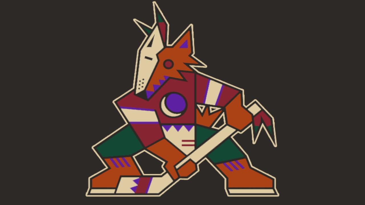
#10: The Coyote of Many Colors (1996-2003)
Phoenix Coyotes
When the Winnipeg Jets dissolved due to financial issues after 17 years in the NHL, the American Southwest became a hot spot for some good ol’ fashioned ice hockey. Sure, maybe Phoenix didn’t seem like the most logical destination, but the artistic flavor of the region meant a top-notch logo would be inevitable. The result was a colorful coyote brandishing a hockey stick, designed in the Native American“kachina” style. Unfortunately, some fans didn’t warm up to the multi-colored coyote, which was seen more as an unfinished art project than as a fully realized logo. By 2003, the Coyotes had a new arena and a new logo, but they would revisit the coyote of many colors again in the future.
#9: Year of the Cowboy (1998-2007)
Calgary Flames
Back in 1980, the Calgary Flames debuted in their native Alberta and nobody seemed to have an issue with their iconic Flaming C logo, a carryover from the flaming A from their days in Atlanta. In fact, the easily identifiable look became an NHL classic. But 1998 was the “Year of the Cowboy,” so the franchise introduced the Flaming Horse head logo for their alternate jerseys. It’s not that the yellow-headed horse isn’t striking, but many fans didn’t quite understand the new look. That being said, the logo did manage to withstand public scrutiny and survived into the new millennium.
#8: Nautical Roots (2015-)
Los Angeles Clippers
After the Donald Sterling fiasco of 2014, LA’s less popular NBA team needed a change. Former Microsoft CEO Steve Ballmer purchased the franchise and the Clippers proceeded to get rid of the existing giant basketball logo to connect with their nautical roots. Supposedly an attempt to add “dimension and energy,” the new logo was criticized by some fans, who found it to be nothing more than a couple of squiggly lines, complemented by a noticeably smaller basketball. Regardless of the less-than-positive Twitter reaction, some people are suckers for bold outlines, even if the overall look had many Clippers die-hards scratching their heads.
#7: The Igloo (1979-95)
Quebec Nordiques
For the early part of the ‘70s, the Quebec Nordiques made a successful run in the World Hockey Association. Once the WHA dissolved, the squad continued in the NHL with a logo that was perhaps a bit too artsy for the average fan. Sure, the symbolism is there with the hockey stick, blue puck and oddly shaped igloo, all formed in a vague N shape; but some felt it was too ambiguous and – frankly – elephant-like. The team must’ve known it was strange, because they had a new logo lined up before they shipped off to Colorado in 1995. While many native Quebecers still sport the igloo for nostalgia’s sake, it remains a curious case in the history of logo design.
#6: The Stinger (2000-03)
Columbus Blue Jackets
Nowadays, the Columbus NHL franchise has embraced a sense of patriotism for their logo, drawing on Ohio’s Civil War past; but that wasn’t always the case. To be fair, the Stinger does feature some red, white and blue flair, yet it still looks somewhat disturbed and ready to check somebody into the boards. And wasn’t this character created to supposedly “capture the spirit of Columbus.” Nevertheless, this alternate logo was eventually squashed in favor of a more commercial aesthetic, as some suggested the Stinger symbol didn’t exactly embody the spirit of a top-tier professional franchise. Some say it looks more like a comic book superhero than an iconic NHL badge. But it definitely created a buzz when it was unveiled.
#5: The Shield (2008-)
Oklahoma City Thunder
In 2008, the Seattle Supersonics relocated to become the Oklahoma City Thunder. To the good fortune of the Midwestern NBA franchise, they had one of the most promising young talents on their squad in Kevin Durant. Of course, while the team consciously avoided thunder-related clichés, they developed a logo that didn’t necessarily convey a youthful vibe. The team’s three-letter abbreviation is the central feature, with a basketball appearing slightly behind it – which does technically make sense given that they’re a basketball team. A couple of stripes in blue and orange round out the logo, but do little to strengthen the shield-like shape. One has to wonder how such a design has survived given the team’s increasing success.
#4: The Fisherman (1995-97)
New York Islanders
The New York Islanders were doing just fine, having won four consecutive Stanley Cups in the early ‘80s. Beloved by fans and synonymous with their success, theirlogo was iconic and featured the silhouette of Long Island along with a hockey stick and letter Y combo. But then came the dreaded re-brand. No, that’s not Gorton’s fisherman as many theorized, but rather just “a” fisherman with a love of hockey. New Yorkers could never quite get behind this logo, and after just a couple of years in existence; the emblematic fisherman was sleeping with the fishes. Maybe it was his strange coloring, or maybe it was his aggressive facial expression, but this one seemed destined to fail.
#3: The Crew (1996-2014)
Columbus Crew SC
When the Columbus Major League Soccer club emerged in 1994, it seemed important to emphasize the blue-collar nature of the city. While some franchises prefer abstract logos, and others go with a more playful feel, the Columbus Crew used actual people. With the black and yellow palette becoming known as the “banana kit,” the shield itself was said to look more like a television advertisement or a Village People album cover than a reference to American sports. But these shadowy figures do look tough, and “The Crew” maintained a lasting presence in Columbus until a 2014 re-brand was adopted to match up with the evolving nature of the city.
#2: The M (2012-)
Miami Marlins
Previously known as the Florida Marlins, the Major League Baseball team in Miami switched things up in 2012 by taking on the name of their home city. Whereas the FLORIDA Marlins had gone literal with their logo design, the MIAMI Marlins took a straightedge and multi-colored approach for their new logo aesthetic. From a practical standpoint, it works. The vibrant M immediately sticks out with a color palette that represents the Oceanside locale, but overall, many saw the logo as bland and somewhat boring. And that doesn’t seem to vibe with the energy of M-I-A. It’s a bold look for sure, but a more natural and organic design might have suited the team better.
Before we unveil our top pick, here are a few honorable mentions:
- The Webbed D (2006-)
Anaheim Ducks
- The Hurricane (1997-)
Carolina Hurricanes
#1: Maxie Miner (1974-81)
Denver Nuggets
In 1976, the Denver Nuggets joined the NBA after a merger with the American Basketball Association. Representing Colorado’s mining history, the bearded basketball enthusiast featured on their logo conveyed all the excitement of what was to come. While it’s undeniable that the logo showcased a vibrant energy, the team must’ve had a few better options. Even Maxie Miner’s the physical posture is off-putting to some, as this looks more like a mascot design than a team crest. Even the man’s disproportionate arms give the impression of a rough draft that somehow got approved. Beloved by some, reviled by others; this logo made it all the way into the ‘80s before being replaced by a variation of the current logo.
Do you agree with our list? Which North American professional sports team logodo you think is the ugliest? For more sports-themed Top 10s published every day, be sure to subscribe to WatchMojo.com.

 0
0
 1
1
 flagged