Top 20 Hidden Messages In Famous Logos
- Welcome to WatchMojo and today we're counting down our picks for the top 20 hidden messages in famous logos.
- Old Milwaukee Brewers
- London Symphony Orchestra
- Toyota
- GameCube
- Hope For African Children Initiative
- Wendy's
- McDonald's
- Apple
- Sanderson Spartan Golf
- The National Lottery
- US Cyber Command
- Sony Vaio
- Tostitos
- Bronx Zoo
- Baskin-Robbins
- Le Tour de France
- Unilever
- Toblerone
- FedEx
- Amazon
#20: Old Milwaukee Brewers
This baseball team’s logo has changed a ton over the years, and it wasn’t until 1978 that this clever ball-in-glove emblem surfaced - which, by the way, just so happens to represent the letters “M” and “B” for the team’s name. Clever, right? What’s even more satisfying is that this design was completed by an art history student as part of a new-logo competition by the team - and the student absolutely nailed it. It represents a massive improvement over the previous Barrelman logo, and just screams put me on a cap and jersey.
#19: London Symphony Orchestra
Imagine, your brief is this - make an iconic logo from the letters LS and O, something that’s classy and representative of music. Something that won’t look out of place alongside the names Beethoven and Tchaikovsky on a poster. Well, the result was this, a cursive script logo containing said letters that just so happens to form the shape of a conductor holding a baton, as if guiding an orchestra. This logo has received several awards for its genius outline, and it’s one of those once you see it, you can’t unsee it, kind of designs. It’s stylish, subtle, timeless and elegant - a bit like classical music.
#18: Toyota
Get ready to put your thinking caps on next, because this one is a little more convoluted. At a glance, the Toyota logo is a mish-mash of different ovals, creating a vague “T” for Toyota shape. But the Japanese brand claims it’s much more than that. Toyota says that its three oval logo represents the brand’s three core values, all intertwined. One, the heart of the customer, two the heart of Toyota as a brand, and three the world embracing the brand. There’s a ton of other easter eggs too; Toyota can be spelled out with the various different oval shapes, it kind of looks like a steering wheel, and the different thickness of lines used for each oval are said to be a nod to Japanese calligraphy and culture. And here’s us thinking it was just the letter “T”. Duh.
#17: GameCube
We wanted to bookend this logo with Toyota, because they’re kind of similar, both being a logo within a logo, within a logo. Firstly, this trademark is a cube within a cube, which looks cool and represents the actual physical shape of the console itself. But said cubes are also sneakily hiding the abbreviated “G” and “C” letters of the GameCube name. The outer cube is the “G” and the negative space between the two cubes is the “C”. Mind blown. The GameCube famously went head to head with the Playstation 2 and, well, didn’t come out on top. Consoles aside though, if it was a battle of logos, the Nintendo-branded GameCube wipes the floor with it.
#16: Hope For African Children Initiative
We’re back to clever yet simple designs next, with the Hope For African Children Initiative having arguably the most heart-warming message around. The logo takes the form of the continent of Africa, but look closer and you will see the outlines of a child and an adult looking at each other. Given its brand values and its focus on humanitarian aid - particularly when it comes to vulnerable children - this iconography perfectly represents the hope that accompanies the brand. And it’s so subtle - if you actually look at the shape of the continent of Africa, the logo isn’t that much of a stretch - which is what makes it so iconic.
#15: Wendy’s
Fast food chain Wendy’s rethought its logo in 2012, freshening up its freckle-faced mascot and opting for a casual font. Wendy’s signature smile remains, as does her ruffled collar, but the button has been moved ever so slightly upwards. No big deal you might say, but the new shape appears to spell out the letters ‘M’ ‘O’ ‘M’… As in ‘mom’… As in ‘our food is as good as mom’s home cooking!’ Company execs say the hidden link is unintentional, but logo buffs are positive that it was done on purpose. Either way, it gives a whole new meaning to ‘parental guidance.’
#14: McDonald’s
The famous golden arches haven’t always been the symbol of choice for McDonald’s. When the fast food giant started up in the 1940s, the brand mascot was Speedee – a quick-to-serve chef with a smile. The arches were an architectural design initially, used for the first franchise stores in the ‘50s. The ‘M’ or “Golden Arches” logo came next, and is now one of the most recognizable insignias on the planet. But some believe the ‘M’ is more than just a starting letter. According to psychologist Louis Cheskin, the shape works wonders on the subconscious and reminds customers of a pair of nourishing breasts –those of ‘mother McDonald’ in particular! What do you suppose Ronald would make of that??
#13: Apple
The story behind the Apple logo is an ever-changing one. Some theories say that it represents knowledge – based on the Biblical connection to Adam, Eve, and the Garden of Eden, as well as an apple being Isaac Newton’s inspiration. Logo designer Rob Janoff has previously insisted that the image was only made with aesthetics in mind. Other whispers from the tech giant suggest the symbol is a nod to computer science pioneer, Alan Turing, who died eating an apple laced with cyanide, therefore inspiring the bite out of Apple’s logo. However, Janoff says the bite is only to give a sense of scale. When asked if the link to Turing was true, Steve Jobs famously replied, “God, we wish it were.”
#12: Sanderson Spartan Golf
We’ve got another sports logo for you next, and it’s one of the most extensive badges on this list. Sure, at a glance it’s a golfer swinging their club, with a giant “whoosh” arching from top to bottom. But that whoosh also forms the part of a Spartan’s helmet, and the golfer’s silhouette helps form the Spartan’s face. Honestly, this logo is more of an optical illusion than anything else, because some may only see a Spartan and not a golfer. It truly is a masterclass in graphic design. A hole in one, if you will.
#11: The National Lottery
Playing the lottery is all about luck. Make sure you carry a rabbit’s foot, horseshoe, four-leaf clover, and of course, cross your fingers. The National Lottery logo leans into the latter, with its blue smiley face mascot also representing a hand with its fingers crossed. The fingers helping create the eyes of this face is inspiring, and for good measure, it’s also in the Union Flag’s iconic deep red and blue hues. The UK’s state-franchised national lottery has been bossing this logo since it was launched in 1994, and although it’s been tweaked a little, it has remained virtually unchanged.
#10: US Cyber Command
The hidden message in this logo requires a little bit of sleuthing to uncover it. It’s an interesting, patriotic emblem, sure, with a globe encompassing the US Cyber Command’s commitment to worldwide cyber security. However, have you ever noticed the 32-character code surrounding the gold inner rim? Well, they represent the MD5 hash of the group's mission statement - an MD5 hash being a 128-bit cryptographic code used to verify message data integrity - obviously. In other words, this 32-character code is a shortened version of what US Cyber Command stands for. It’s hardly a catchy quip - but hey, they’re in the business of cyber security, it’s supposed to be esoteric and confusing.
#9: Sony Vaio
Speaking of things only understood by a select few - how is your legacy ani-digi knowledge? The Vaio logo is multi-faceted. Firstly, the VAIO letters stand for Visual Audio Intelligent Organizer. The logo itself is made up of two parts, the “VA” and the “IO”. The first part is designed to look like a sine wave, or analog wave, and the “IO” is actually supposed to represent binary code. Together these are supposed to show the merging of analog and digital signals, or the progress and journey of technology.
#8: Tostitos
Tostitos are a must-have on movie night and a camp-out classic, but if you’re ever unsure of exactly how to eat them then just take a look at the packaging. The second and third ‘T’s are actually people like you and me, or whoever else you happen to be sharing with. While above the ‘I’, there’s a bowl of red-flavor dip – we’re guessing salsa – and the triangle of yellow is a Tostitos chip itself. The only thing this logo doesn’t tell us is how two snackers are able to split one chip? That’s a serious friendship test right there.
#7: Bronx Zoo
Sometimes it’s in the white space of a logo where the really clever stuff happens. At first glance, the sign for the Bronx Zoo is a silhouette of two giraffes and three birds in flight. But, look closer at the negative space and you see a city skyline made up of NYC-inspired skyscrapers. Not only is this logo a clever use of shape, but it also perfectly sums up what the Bronx Zoo is all about; magnificent animals in the middle of a metropolis. The zoo changed its branding in 2015 in line with the Wildlife Conservation Society, a conservation organization that manages it, but the giraffes of the past are still genius.
#6: Baskin-Robbins
Company initials; pink and blue lettering; there’s nothing else to it, right? Wrong! The logo for the world’s biggest chain of ice cream specialty shops, Baskin-Robbins, also incorporates the brand’s signature claim to 31 flavors, one for every day of the month. If you read only the pink part, then the magic number magically appears – it’s an uncomplicated message, which really is hidden in plain sight. Of course, since company founders Burt and Irv set out their stall in 1945, hundreds of unique flavor combinations have been created. But, at Baskin Robbins’ ice creamy core, the original number still holds up. And even though the logo has been tweaked from the one most of us probably know, it still contains the sacred “3” and “1” digits.
#5: Le Tour de France
In bicycle racing’s flagship event, we find one of the cleverest rebrands in recent history. French designer Joel Guenoun created the Tour de France logo for the 2003 race, which was also the 100th anniversary of the tour. A breakaway from the event’s once corporate-looking crest, it features a dynamic font and a dash of yellow in line with the famous jersey given to the race leader after each stage of the event. But look closely at the yellow circle and the ‘R’ that overlaps it, and see a cyclist hunched over his front wheel. It’s subtle, but it’s brilliant.
#4: Unilever
There's’ a lot of different brands, from a lot of different industries, that sit within the consumer-goods company Unilever. And looking at its logo design, it’s clear that Unilever wants you to know it. Of course, the logo is a giant “U”, which stands for Unilever, but that U is made up of 24 different icons, each one representing a different aspect of the business and its commitment to sustainable living. There’s the sun - a source of light and renewable energy - a chili pepper - one of the many ingredients in its products - a spoon, a bowl, an ice cream, a flower, a palm tree, a heart - you get it. This is a logo that quickly, but extensively, says “this is who we are”, drink it in.
#3: Toblerone
Born out of Bern in Switzerland, Toblerone remembers its roots with its logo, which features the city’s Matterhorn mountain. But Bern is also the City of Bears, which is why you can find the animal hidden in the white space on the mountainside. It takes a little while to adjust your eyes, but there’s definitely a bear there, rearing up on its hind legs. We’re just glad that the real life bears aren’t almost as big as real life mountains – what a world that would be! Nevertheless, this logo could justifiably double up as a local coat of arms!
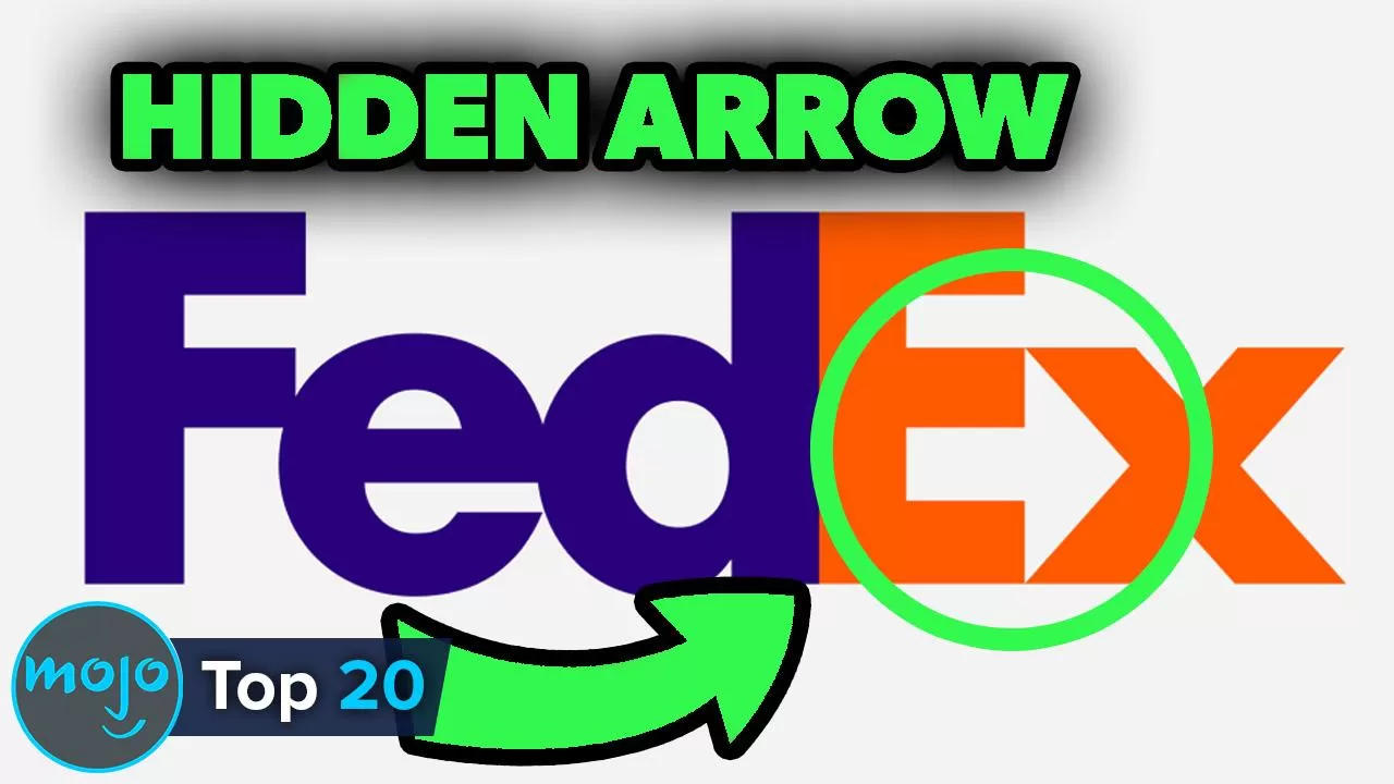
#2: FedEx
Our runner-up is another awesome use of negative space, made all the better because the FedEx logo seems so straightforward. As a global shipping company, FedEx is a courier service carrying items from A to B. If you were to sum the company up using just one symbol, that symbol would be an arrow. And if you ignore the letters and just look at the white space, that’s exactly what you see; between the ‘E’ and the ‘X.’ It’s so subtle it looks as though it could’ve been an accident, but designers worldwide laud the FedEx logo. Lindon Leader is to thank for the world famous wordmark, which has been a graphic designer’s ‘go to’ ever since its creation in 1994.
#1: Amazon
As ‘Earth’s most customer-centric company,’ the Amazon logo is instantly recognizable. This makes it even more impressive that it actually offers three layers of hidden meaning. First, and most obvious of all, there’s a curved arrow to symbolize the shipping of goods. Second, that same arrow doubles up as a smile – telling us that this brand of online shopping is an enjoyable experience. Finally – and here’s where things get real clever – the arrow stretches from the ‘a’ to the ‘z’ of the brand name – showing us that there’s nothing which can’t be bought on Amazon. From an abacus to a zip-line, an anvil to a zipper; it’s all here, and it’s all covered by one clever logo.
So, did we miss any clever logos off our list? Let us know in the comments!
