Top 20 Most Embarrassing Logo FAILS
#20: Wisconsin Tourism Federation
You know it today - if you know it at all - as the Tourism Federation of Wisconsin. But back, prior to 2009, they were the Wisconsin Tourism Federation. So, why the name change? You can blame the internet for that. Or more specifically, the way the internet and texting culture created the popularity of acronyms. You see where we’re going with this one? Well, for decades WTF didn’t mean anything to anyone - but come the internet and messaging, WTF is now easily recognized as … well, you know. And so, the Wisconsin Tourism Federation did a little rearranging of their acronym.
#19: “Japan Heritage”
Is Japan The Next Space Superpower? | Unveiled

In 2015, Japan’s Agency for Cultural Affairs launched a program called “Japan Heritage.” According to a Japanese travel news site, one of the main goals of the program was to “assist local branding or foster local identity.” This might seem a bit ironic given the logo the program launched with at the time. While we appreciate the simple white background and red circle representing Japan, their choice of font seems a little, let’s say… not good? While the “Japan” is pretty identifiable - if you didn’t know the logo was for “Japan Heritage,” what are the odds you would’ve been able to identify that second word?
#18: Airbnb
Top 10 Worst Airbnb Stories: Times Things Went Wrong
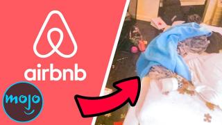
Launched as Air Bed and Breakfast in 2008, the company became Airbnb in 2009 with a simple bubble-letter logo. After growing exponentially the company felt it needed a refresh - and in 2014 came a redesigned website and a brand new logo. While the new logo was meant to represent people, location, love and the letter “A”, for many it just looked like any number of private parts - male or female ones, depending on how you look at it. And there was no shortage of “redesigns” featuring the logo incorporated into various anatomical drawings.
#17: Mama’s Baking
Mama’s Baking is a Greek bakery and for their logo design they wanted something that combined the idea of “Mama” and “baking.” Now, we can think of a lot of good ways those two things can be combined visually - but a lady with a fire on her midsection isn’t one of them. Maybe the lower half of the design is supposed to be an oven? Either way, the two round breasts and the hot middle don’t really sell the idea of “Mama’s Baking” - but more the idea that “Mama needs to take antibiotics.”
#16: Gap
Top 30 Marketing Fails

What’s wrong with the Gap logo you ask? The company name in a navy blue box is iconic. But we aren’t talking about that logo. We’re talking about the short-lived logo redesign the company introduced on October 6th 2010. The one featuring “Gap” in a bold font with a little blue box at the top right-hand corner of the “p.” If you wanna talk about consumer backlash, just go and read the thousands of social media posts that hated on the new logo. Can you blame them? That thing is lame! And if you thought the Coca-Cola company went back to original Coke from New Coke quickly - that’s nothing compared to the literally 6 days it took Gap to go back to the old logo.
#15: Donald Trump/Mike Pence Campaign Logo
Most of us are familiar with the simple 2016 campaign logo featuring a large lettered “Trump” in blue with a slightly smaller red “Pence” underneath. What you may be less familiar with is the first logo the Trump/Pence team put out with the intertwined “T” and “P” and the red and white stripes beside it. And while we understand the stripes are an obvious ode to the American flag, we’re with former Democratic Rep. John Dingell on the T/P thing. Following the release of the logo Dingell tweeted, “What is the T doing to that P?” Donald Trump screwed Mike Pence for the second time on January 6th 2021. Turns out the first time was in that original Trump/Pence logo.
#14: The First Tokyo Olympics Logo
Top 10 Rebrand Fails
There’s nothing suggestive about the first logo released by the 2020 Tokyo Olympic committee. There’s nothing rude or offensive about it either. The only problem with it was that it looked almost exactly like an already existing logo for the Théâtre de Liège in Belgium. Whether Japanese graphic designer Kenjiro Sano did it on purpose or not we might never know - although he did say that he’d never seen the Liege logo before. But what we do know is that after the Theatre’s logo designer Olivier Debie threatened to sue, the committee scrapped the design and got to work on a new one.
#13: Clinica Dental
When you go to the dentist you obviously expect a certain type of service. However, if this logo for the Clinica Dental San Marcelino is to be believed - maintaining your oral health isn’t the only service they provide to their clients. Although, given how most people hate going to the dentist - maybe they're just trying to imply that a trip to their clinic is a much more metaphorically enjoyable experience than with most other dentists. Metaphorical or not, this logo fail requires more than a couple of rinses to get the bad taste out of our mouths.
#12: The Metropolitan Museum of Art
10 Most Ridiculous Design FAILS
Known colloquially for years as, “The Met,” the Metropolitan Museum of Art in New York City took the nickname to heart in 2016 when they did a full redesign of their logo. Gone was the iconic M in a web of grids and circles ode to Leonardo DiVinci, replaced by a big red “THE” atop a big red “MET.” When it comes to big red things people love “Clifford,” but the same kind of love wasn’t there for the new museum logo in 2016. Architecture critic Justin Davidson was one such hater - describing the new logo as “a red double-decker bus that has stopped short, shoving the passengers into each other’s backs.” We’re going to assume that wasn’t what The Met was going for.
#11: Sat An
Top 10 Worst NBA Fails Ever

Kathrein is a German satellite, antenna and digital solutions company providing many services and products to its clients. One of said products are TV satellite dishes - you know, the kind you see on house and apartment building roofs. Maybe you don’t even notice things like that generally - but were your eyes to land on certain Kathrein dishes, they might stand out a little because of the “Sat An” logo on them. We assume the “Sat” and the “An” are abbreviations for satellites and antennas. However, the company’s decision to not put a space between the two words means instead of Sat An, these dishes are emblazoned with “Satan.” Now that’s one HELL of a mistake.
#10: Kudawara Pharmacy
Let’s say you’re a graphic designer for a Japanese pharmacy and they ask for a dynamic new logo. You’d think that one melding together your organization’s customer-centric philosophy and the first letter of its name would be a great idea. The good news is the two-stick-figure logo received global brand recognition from the likes of Huffington Post, BuzzFeed, and Business Insider, to name a few. The bad news is it’s because your logo looks like two people standing up and gettin’ down, if you know what we mean – let’s just say it’s referred to by some as “The Rear Admiral.” Perhaps Kudawara should’ve made lemons out of lemonade and focused on selling erectile dysfunction drugs…
#9: Vermont Pure Maple Syrup
Only the highest quality product gets Vermont’s Pure Maple Syrup label. Perhaps this slow, painstaking process doesn’t leave time for little things like noticing that their logo looks like a man relieving himself. To be fair, when you stick a tap in a tree and it drips, it’s going to look kinda funny. But, c’mon, Vermont: your state looks like the profile of a pair of beefy legs, and your northeast looks like a butt. Putting the spout right at the base of the hand-like Lake Champlain islands and adding a bucket below it is bound to elicit laughter. Even so, the logo remains a symbol for the highest quality syrup, so why should they change anything?
#8: Office of Government Commerce, United Kingdom
Top 10 Home Office Items You Didn't Know You Needed

In 2008, it was reported that the UK’s Office of Government Commerce spent £14,000 to create a new logo. Unfortunately, when rotated 90 degrees, it looks like a person – or maybe a snowman? – engaging is self-gratification. The general public and news outlets noticed. An OGC spokesman responded, saying the logo, “caused a few titters among some staff.” However, they decided that any combo of the letters “OGC” would look halfway indecent, and that such a logo “was not inappropriate to an organization that’s looking to have a firm grip” on government spending. Riiiight. Three years later, the OGC was absorbed into another agency. We have to assume that maybe its demise was due, in part, to the gripping logo.
#7: Locum AB
Poor Locum. This Swedish property management firm was just trying to thank their customers and wish them a Happy Holidays, while in turn saving some trees, via an electronic Christmas card. To show their love, they replaced the “o” in their all lower-case logo with a heart. And it looks, at least to English speakers, like they are expressing a passion for a certain bodily fluid. Let’s face it: Locum is playing with fire just by having C-U-M as the last three letters of their name, and they poured gasoline on it by e-mailing out what would quickly become a viral sensation.
#6: Mont-Sat
It’s a bit unfair to go after a small, mom-and-pop satellite and antenna installation company in the Lower Silesia province of Poland. But if you’re going to humanize a satellite dish, you could have one very long problem… and Mont-Sat didn’t take that into account. In this anthropomorphized design, the satellite part known as the support arm is placed right above the legs. The result? He looks very happy to see us. But there’s something else about it. Usually, someone with this particular issue would do anything to make sure it is not seen. His hands are up and his tongue is out, however, and he’s seemingly very impressed with himself. Let’s just hope their in-home installers keep things classier.
#5: Kids Exchange
Top 20 Things Only '90s Kids Will Understand
Kerning is the term used in typography to define the spacing between letters. Too much or too little space and readability suffers. But perhaps the greatest kerning cautionary tale is the alleged one-time logo for the Kids Exchange you’ve surely seen on lists like this before. First of all, care is warranted when the letters S, E, and X are clustered together in your organization’s name… especially when your business is focused on children’s items. Also, a person not versed in the laws and regulations of sexual reassignment might find it odd that kids can get a sex change down at their local strip mall. Calling anyone out there using this Kids Exchange logo: can you please just hit that space bar for us?
#4: London 2012 Summer Olympics
The Coolest London Boutique Hotels | MojoTravels

An Olympic logo can be a dynamic representation of the country and city hosting the games. Get it wrong, and oh boy… London’s 2012 logo cost a reported £400,000, and unfortunately, that expenditure didn’t help them avoid major headaches. Problems started back in 2007, when the UK organization Epilepsy Action reported complaints of seizures from animated footage promoting the logo. But that was only the start: Iran lodged a formal complaint saying the letters spelled “ZION” and threatened a boycott. And, as always, there’s the sexual connotation, with some saying it looked like Lisa Simpson giving Bart… uh, do we have to say it? Despite the criticism, the London organizers kept calm and carried on – logo and all.
#3: A-Style
Top 10 Apple Fails

Is it really a fail if they meant to do it? When A-Style founder Marco Bruns created his logo, there was no business idea, no product, no store… just a logo. You could say Bruns built his success through the backdoor, by affixing stickers of his doggy-style stick figures wherever he went, from Milan to Moscow to Miami. He also painted it on the track at the 2004 Tour de France. People noticed, and the brand grew. Now it’s years later, and A-Style sells clothes and accessories displaying their logo, worn by the likes of football megastar Lionel Messi and appearing on motorcycle helmets at MotoGP events. You could say A-Style is living by the mantra “no publicity is bad publicity.”
#2: Sunrise Sushi / Institute of Oriental Studies, Federal University of Santa Catarina
A sunrise over a pagoda can be a beautiful thing; it also can be very penetrating. Our #2 logo is shrouded in mystery: Who designed it? Who used it? Several sources attribute it to Sunrise Sushi, a restaurant that may or may not have been undone by its suggestive logo. The London Telegraph reported that the Federal University of Santa Catarina in Brazil used it to represent its Oriental Studies department, but withdrew it when the logo went viral. What we do know for sure is the pagoda is a mainstay on logo fails lists, with the UK’s Independent once placing among the worst logos to ever be designed. We also know why it became a viral sensation, and so do you.
#1: Catholic Church’s Archdiocesan Youth Commission
It was 1973, and the Archdiocesan Youth Commission, an organization within the Catholic Church, apparently started using this new logo. We should mention that, at the time, the only people privy to details about the Catholic abuse scandals were those within the inner circle of the church and, unfortunately, those who were exploited. It wasn’t until a groundswell of mistrust, and tenacious investigative journalism in the 2000s, that many very shocking truths were uncovered. And, according to a rumor perpetuated repeatedly online, the Archdiocesan Youth Commission was an unfortunate victim of the incident and the overnight meme-ification of found images. The Atlantic asked readers if this was the Worst Logo Ever. Even if this logo is a fake, the irony of the inappropriateness means that our answer is an emphatic yes. Which of these logo misfires is your favorite? Let us know in the comments.
